Echoes from the past ↗
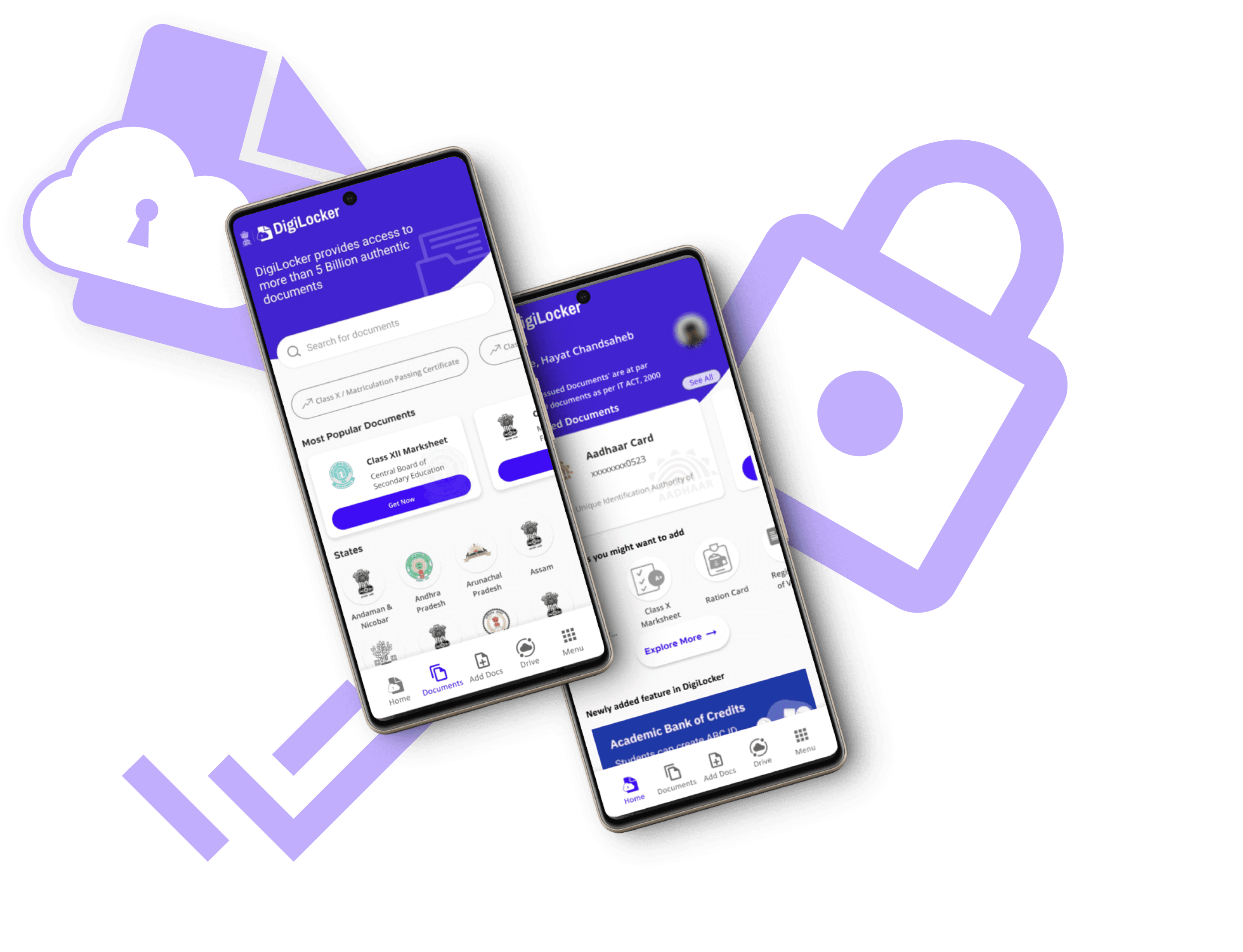
DigiLocker
Design Evaluation
Duration
Dec. 2023 (2 Weeks)
Team
4 Person Team
Practice
Research, Usability studies, UI design, Product thinking & Prototyping
Tools
Figma & Adobe Illustrator
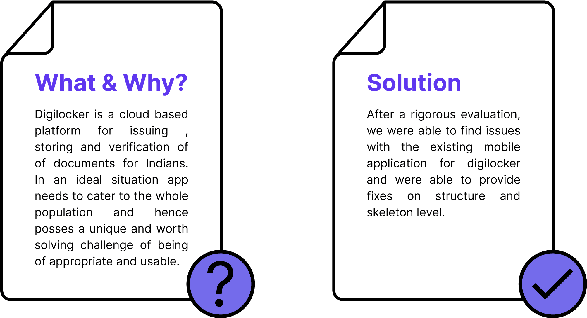
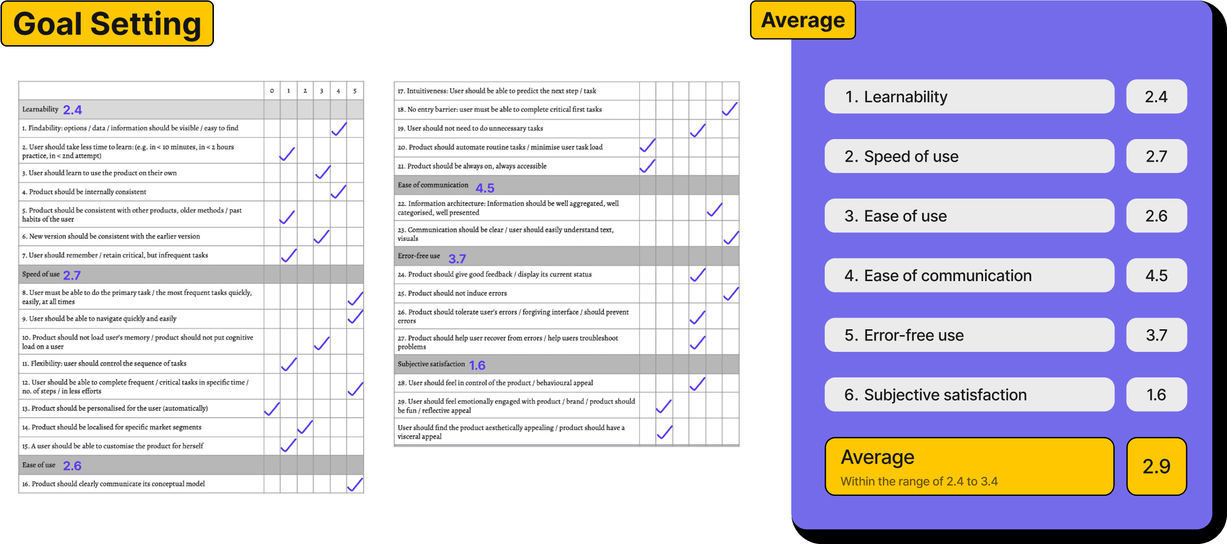
To enhance the usability of the key features of the app, to ensure a user-friendly and secure platform for end users.
Primary Goal
Speed of Use : To ensure that users are able to perform the critical tasks of the app easily and efficiently.
Speed of Use : Users should be able to navigate the app easily.
Ease of Use : Users should be clear about the objective of the
app/features.
Ease of Communication : To communicate all the important features of the app to users of various backgrounds.
Error free Use : To ensure an error free use of the app.
User Experience Goals
No. of Documents Issued, Document Access Rate, User Adoption Rate
K.P.I.

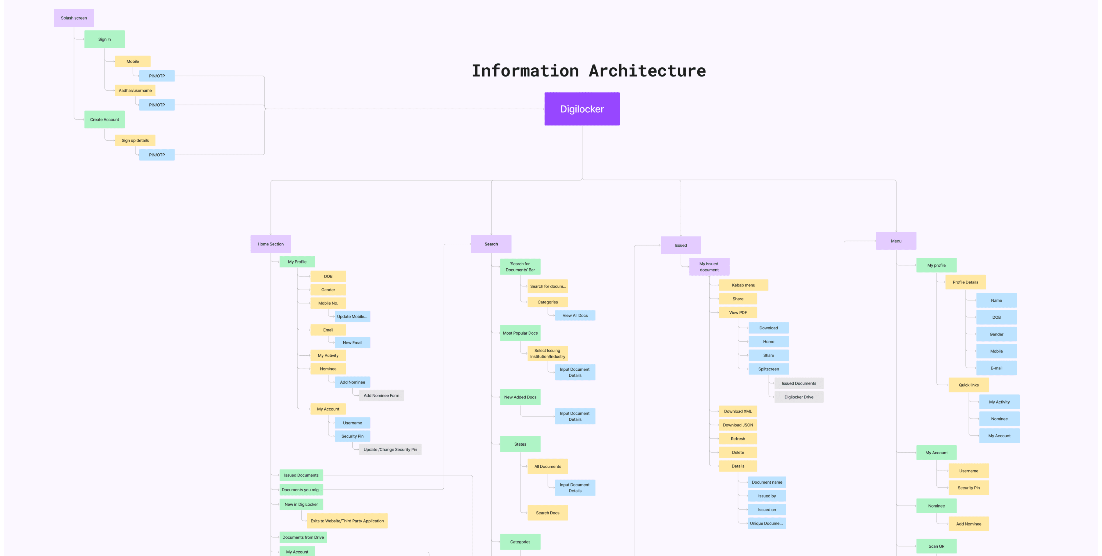
Information Architecture
Analysis of IA
Tasks that are essential for both Novice/ First time User and Expert/ Regular User.
Main objectives of using DigiLocker.
Tasks that are more focused to regular users and can be essential but rarely used by novice users.
One Time Use
User registration
Linking Aadhar
Onboarding
Frequent Use
Document Retrieval
Searching documents
Opening issued documents
Issuing new documents
Sharing a issued document
Uploading documents
Non - Frequent Use
Downloading the document
Adding nominee
Deleting the documents
E-sign documents
Feedback and support
Account Recovery
Evaluation of the current app indicated that the app scores severely low on point 3 & 9, this will be reflected in recommendation made along with primary user experience goal.
100%
75%
50%
25%
0%
1. Visibility of system status
70%
6. Recognition rather than recall
55%
9. Help users recognize, diagnose, and recover from errors
26.6%
3. User control and freedom
25%
2. Match between system and the real world
51%
8. Aesthetic and minimalistic design
43.3%
5. Error prevention
52%
4. Consistency and standards
45%
7. Flexibility and Efficiency of use
44.6%
10. Help and documentation
50%
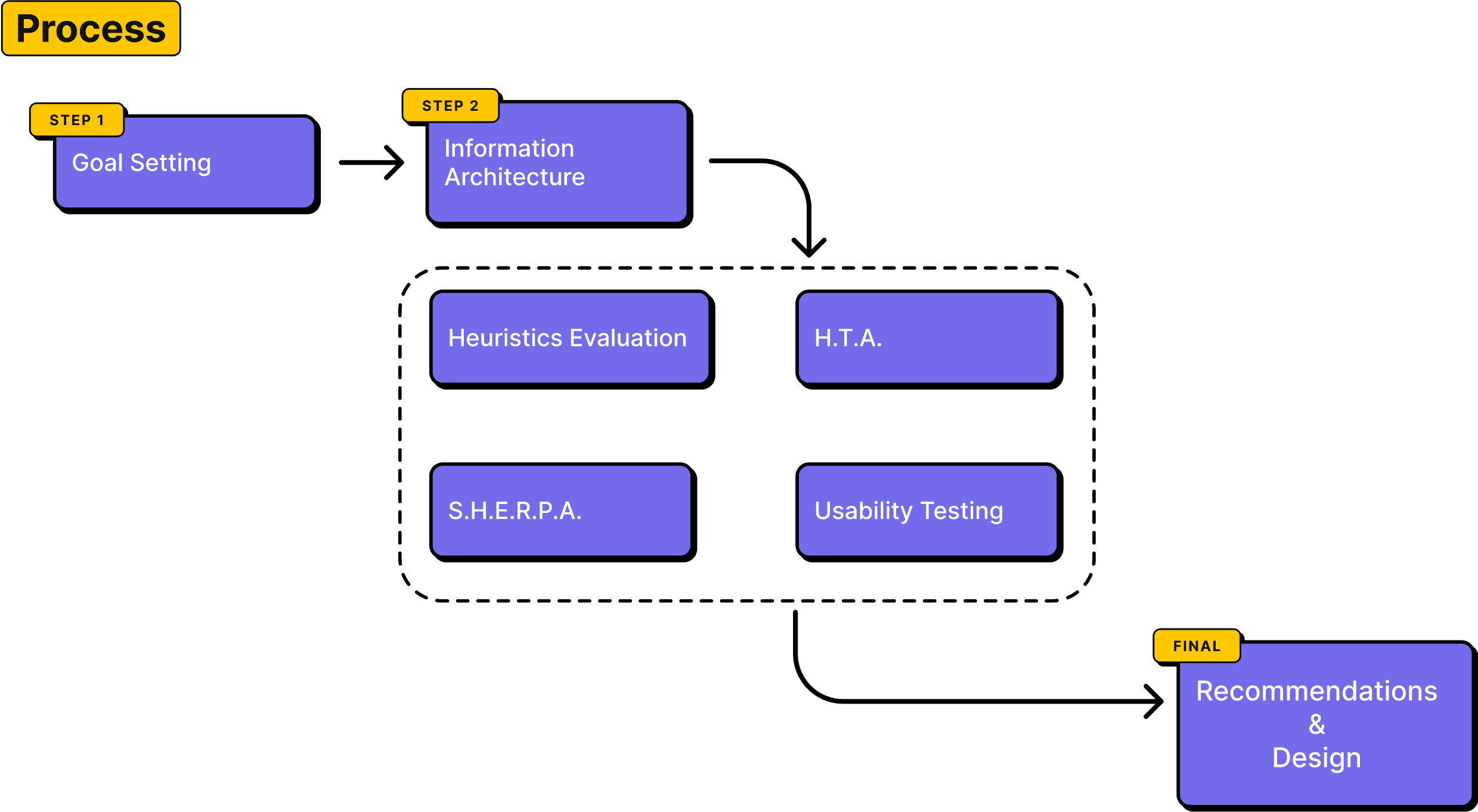
Heuristic Evaluation
01
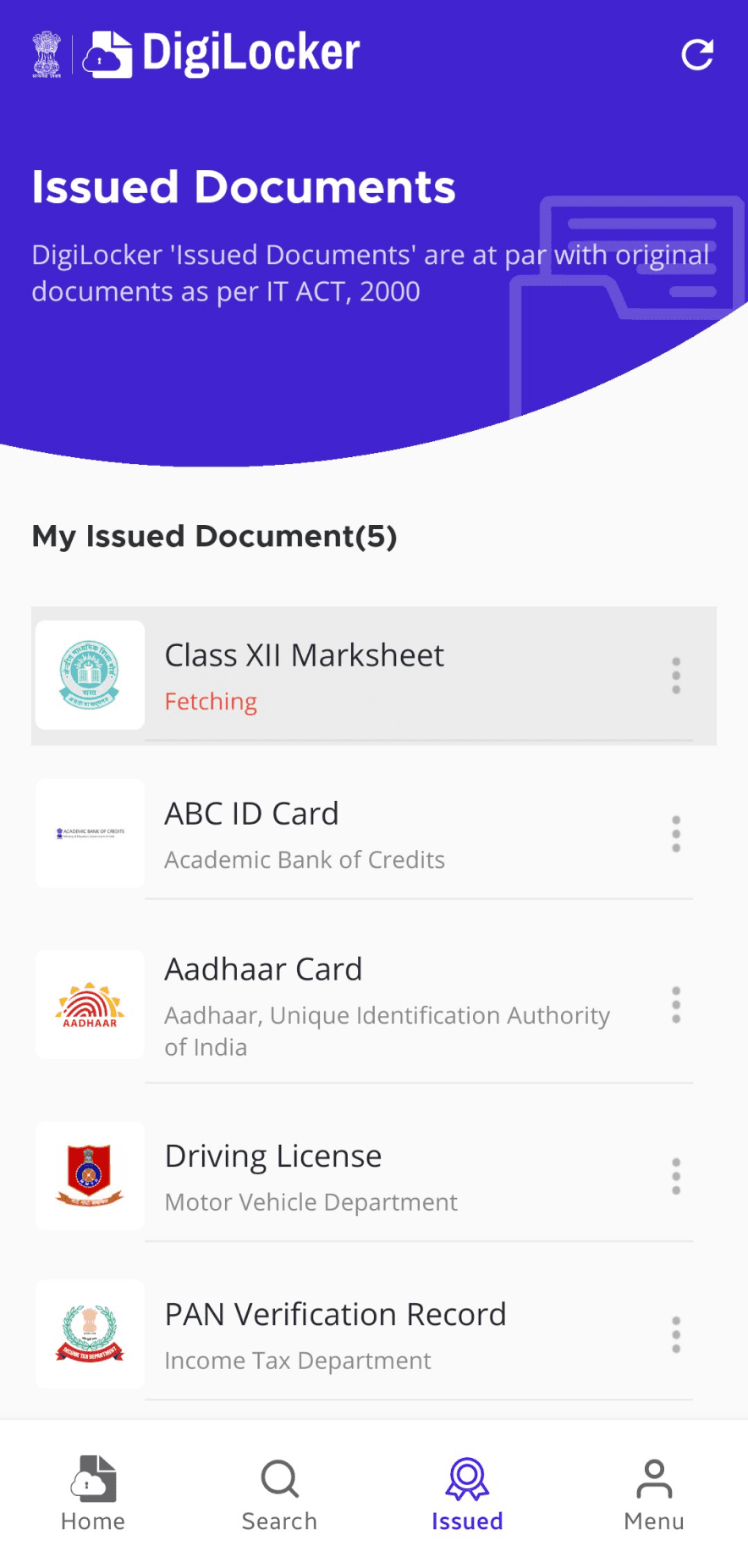
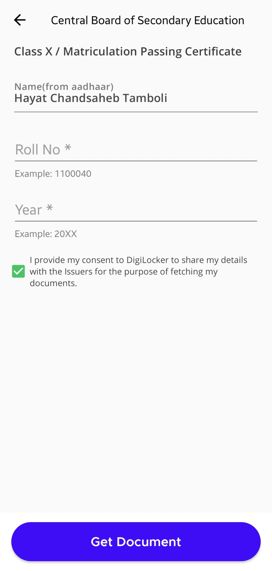
Task completion feedback is almost negligible or not provided.
02
Progress indication for document loading / fetching is small and hard to notice.
03
Buttons, inputs and items have affordance for different states like active, focus, disabled etc.
Snippets of Heuristic Evaluation
Visibility of System Status

01
02
03
03
03
03
Score : 70%
01
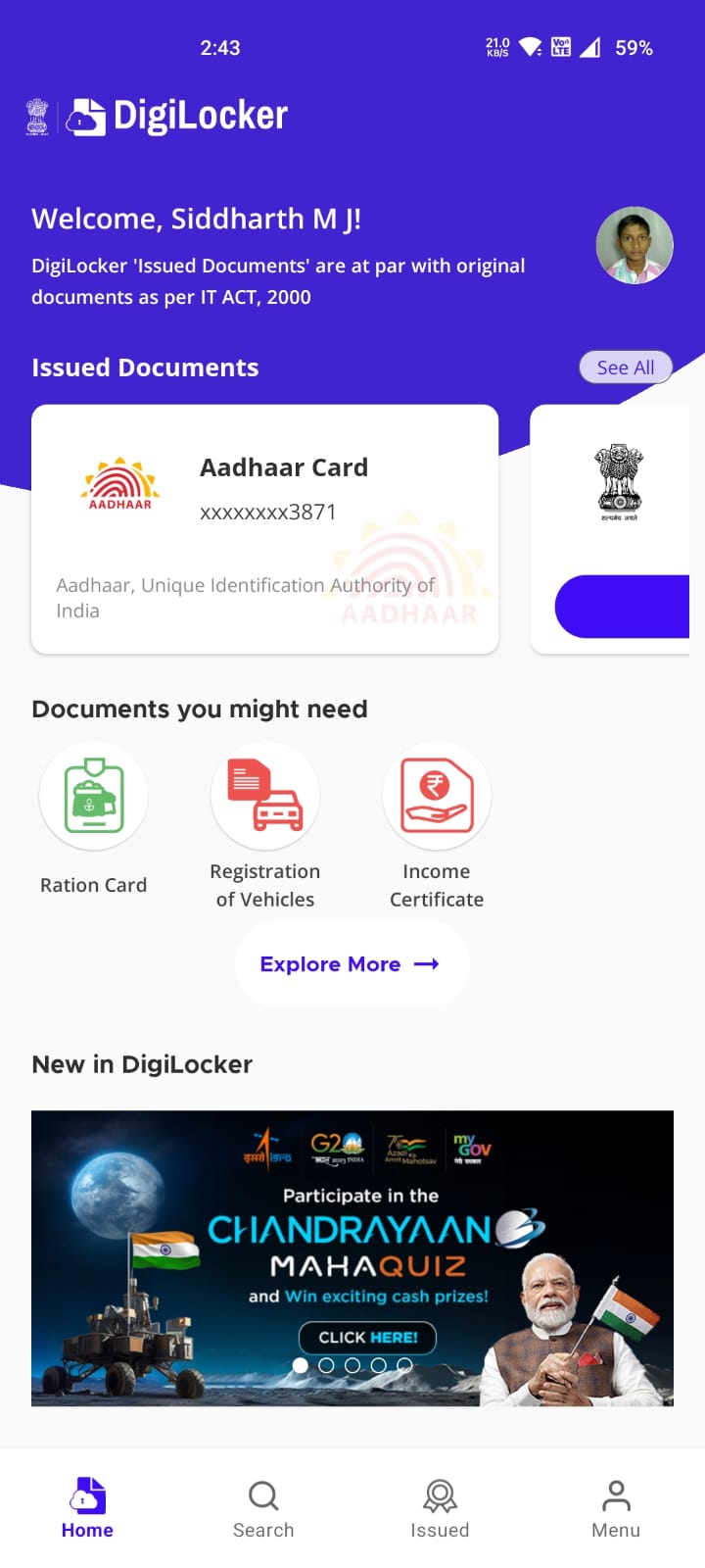
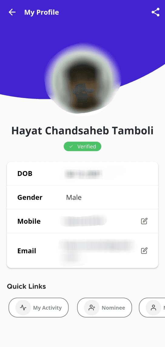
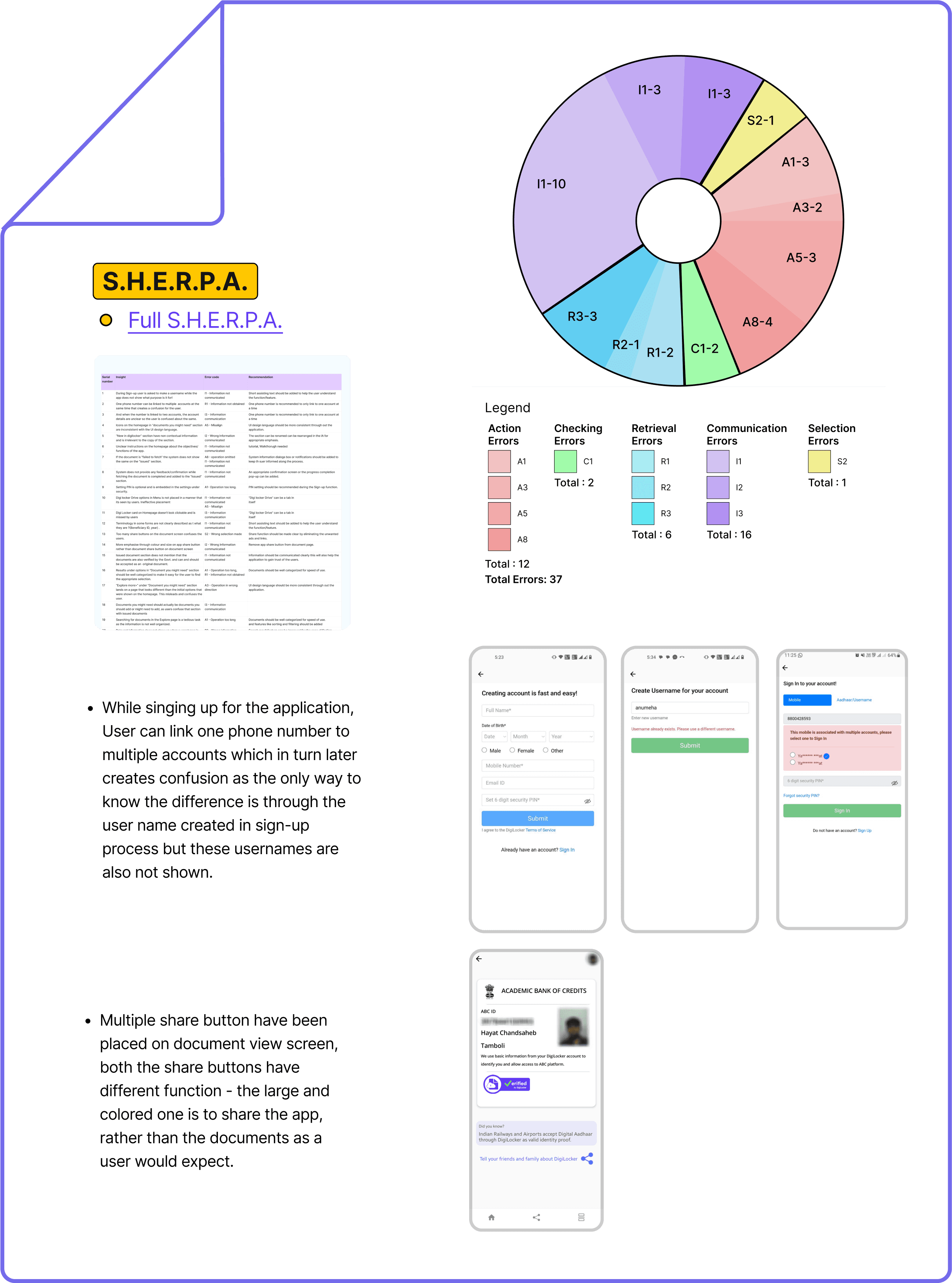
Visual code doesn’t match user level of experience and expectations. Eg: Icons
02
System elements don’t look similar to user’s familiar icons. Eg: Menu and Issued icon.
03
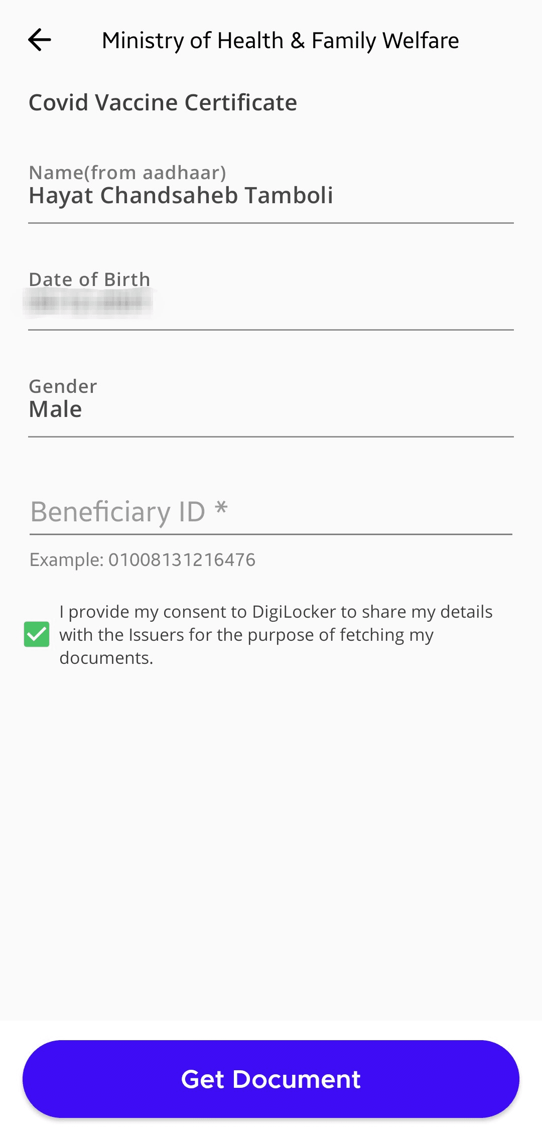
Copywriting is hardly understandable (level of jargon) to end user. Eg: Benificiary ID
Snippets of Heuristic Evaluation
Match between system & real world
03
01
02
Score : 51%
Snippets of Heuristic Evaluation
01
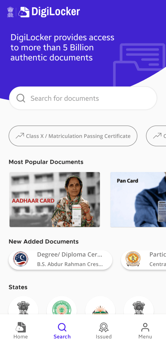
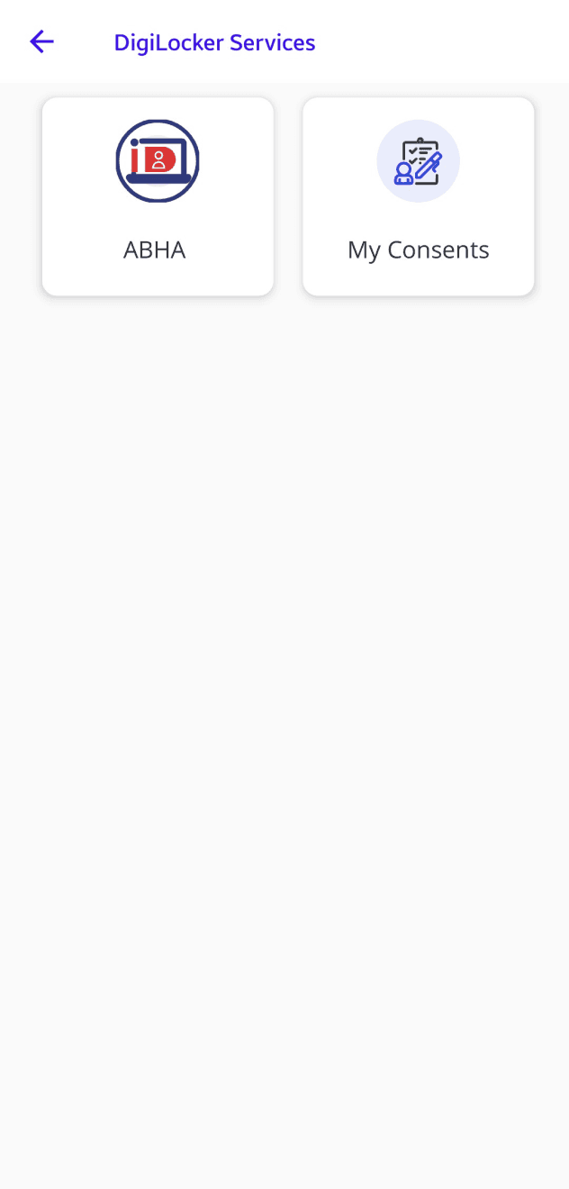
Numerous vital features are hidden in unexpected places/tabs, making them hard to locate or recognize at first glance.
02
Documents showed / issued look different. Screens aesthetics also change between the screens.
03
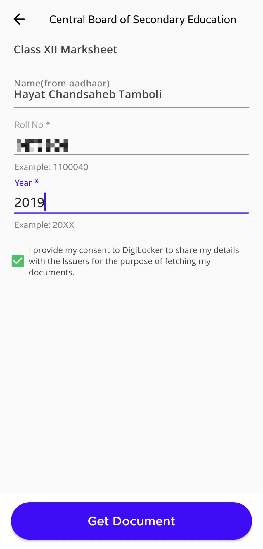
Different terms used for same actions- upload, add, save, get.
Consistency & standards
Score : 45%

01

02

01
System should learn what the user regularly requires and adapt to the current needs.
02
The app caters to a diverse user base, from novices to experienced users, but it provides no guidance for new users. Additionally, it displays irrelevant ads that lead to external pages.
03
New feature not explained or updated about in the app, tucked in a corner.
Snippets of Heuristic Evaluation
Flexibility & efficiency of use
Score : 44.6%
01
02
03
01
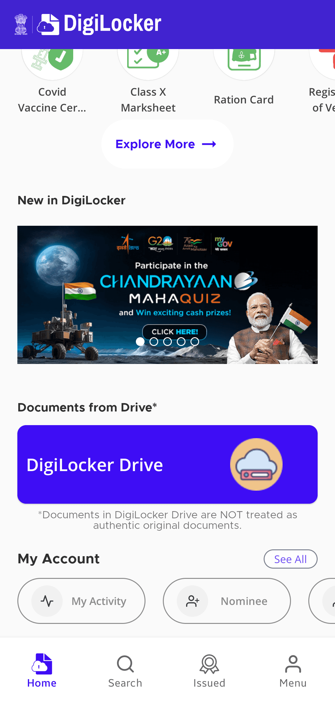
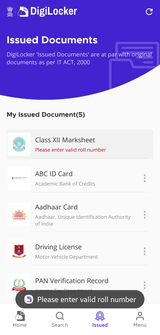
Error messages are inconsistently positioned on the screen or they are not provided altogether. They should have a consistent placement.
02
Add undo action to destructive action which appears for at least 5s after the action has been made.
Snippets of Heuristic Evaluation
Help users recognize, diagnose, and recover from errors
Score : 26.6%
02
01

Hierarchical Task Analysis
Primary Task
Find and delete your 12th marksheet after sharing it.
Situation
A - When user has not issued the 12th marksheet.
B - When user has issued the marksheet.
C - When the user wants to share the document from drive (not yet uploaded).
D - When user already has the document in drive and will share with e-sign (no need to upload).
E - When user wants to compare the drive doc and the issued doc (no need to upload).
What is your age?
Do you use Digilocker?
On which web or app?
How often do you use it?
Website
App
Novice
Novice
Expert
Rarely
Often
Yes
No
Screener
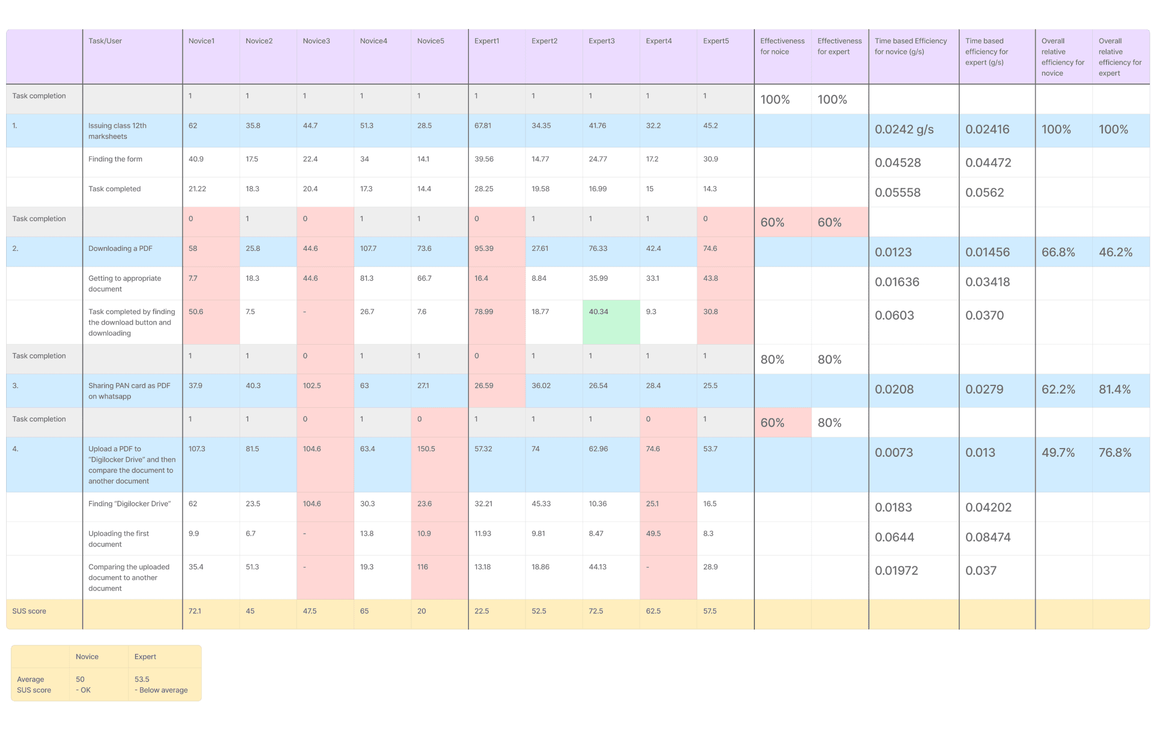
Usability testing results
0
N1
T1 -1
T2 -1
T3 -1
T4 -1
T1 -1
T2 -0
T3 -1
T4 -1
T1 -1
T2 -0
T3 -0
T4 -0
T1 -1
T2 -1
T3 -1
T4 -1
T1 -1
T2 -1
T3 -1
T4 -0
72.1
N2
45
N3
47.5
N4
65
N5
20
100
0
E1
T1 -1
T2 -1
T3 -1
T4 -1
T1 -1
T2 -0
T3 -0
T4 -1
T1 -1
T2 -1
T3 -1
T4 -1
T1 -1
T2 -1
T3 -1
T4 -0
T1 -1
T2 -0
T3 -1
T4 -1
22.5
E2
52.5
E3
72.5
E4
62.5
E5
57.5
100
Novice
50
Average S.U.S. score
53.5
Expert
SUS score of ~50 for both the types of users indicate that the app was equally difficult for both of them and the app lacks learnability and memorability.
Recommendations
& Redesign




Home
Documents
Add Docs
Drive
Menu
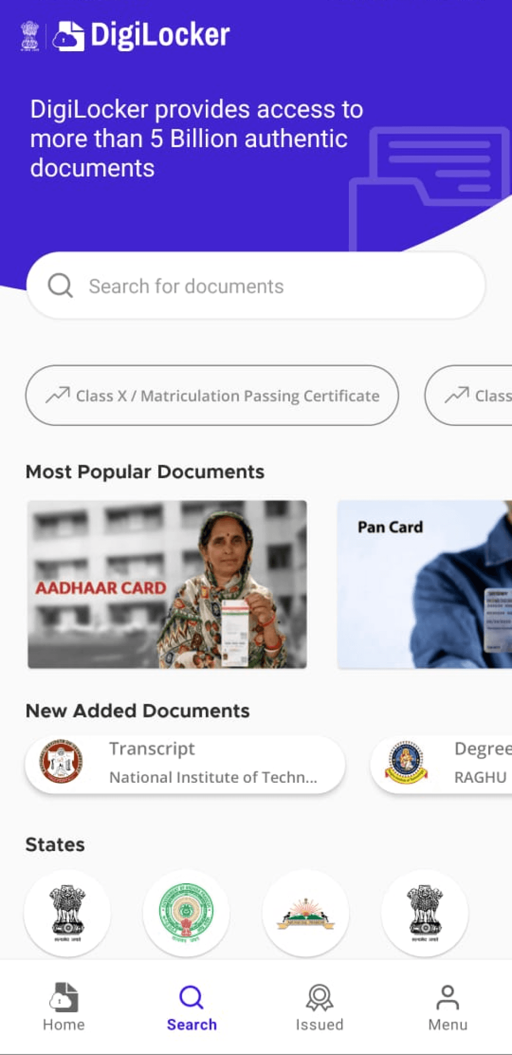
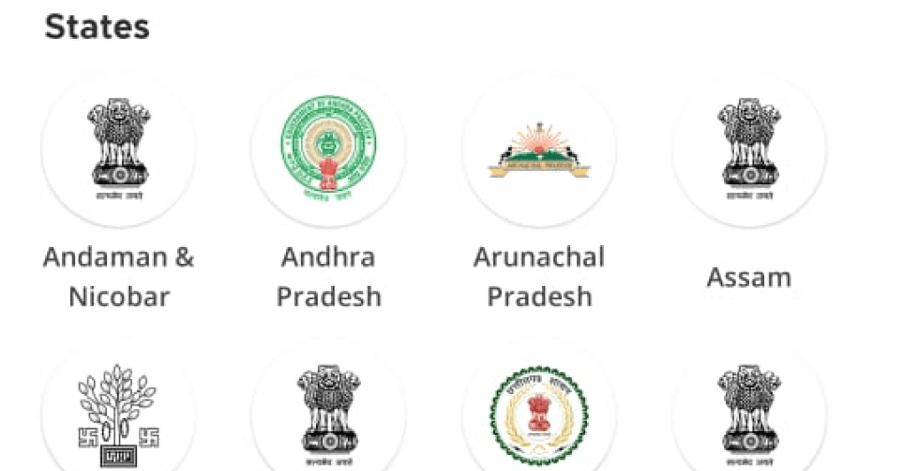
Search screen as of now.
Removing “Newly added Docs”
Fixing the Tabs to be more consistent with the rest of the app.
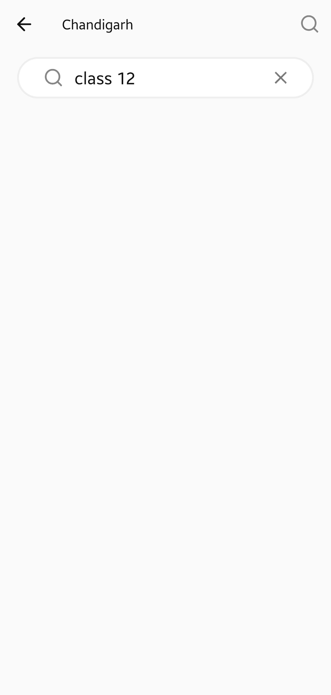

The document is not added by the state. Please check the Menu Tab to check the list of documents that can be added on DigiLocker.
The document is not added by the state. Please check the Menu Tab to check the list of documents that can be added on DigiLocker.
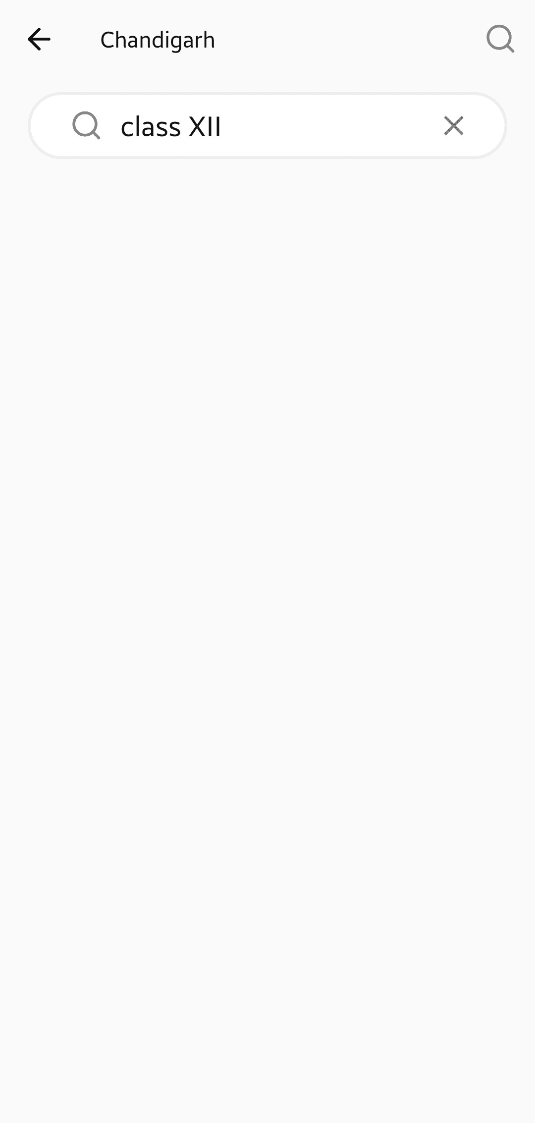
No such document found. Please check the spelling again.
xajbxuas
Added information on search
screen to indicate the status of document wrt the app.
Search feature can also automatically merge requests in latin and roman numerals.
Search feature now gives a concrete feedback if/when the document is not found.
Search Screen
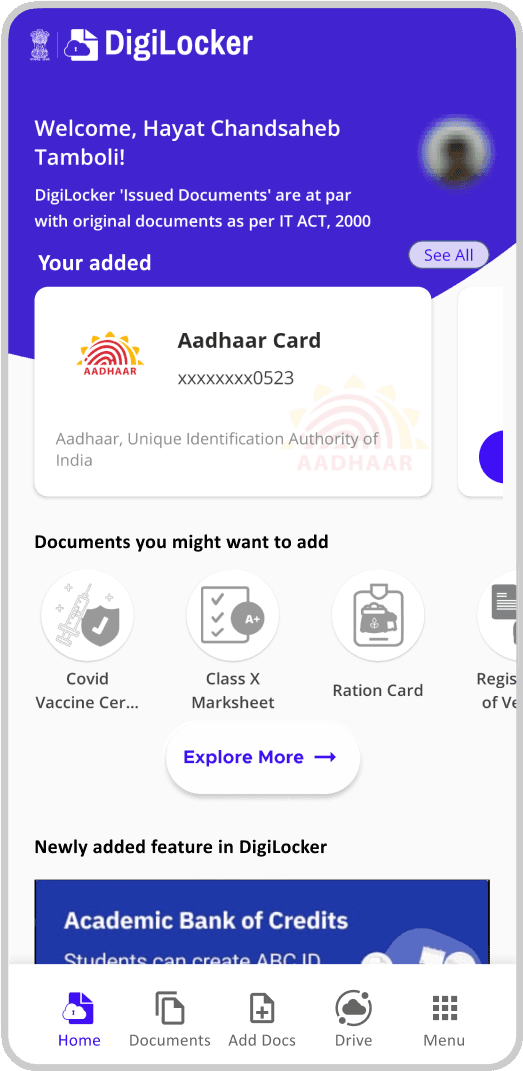
Home Screen
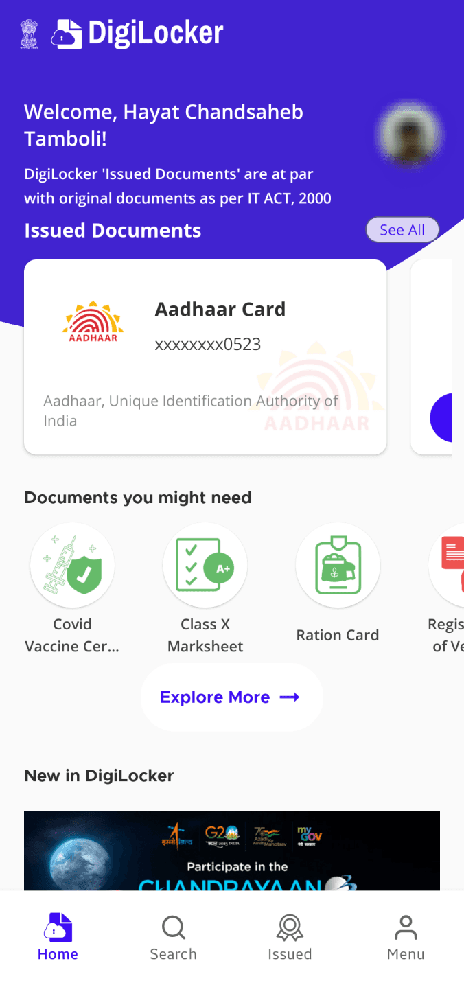
How the screen looks after first time log-in as of now.
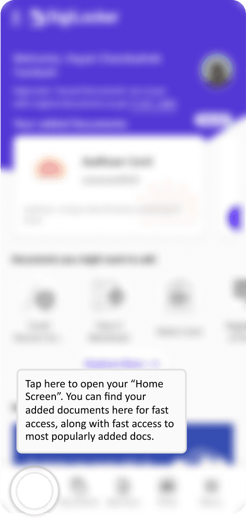
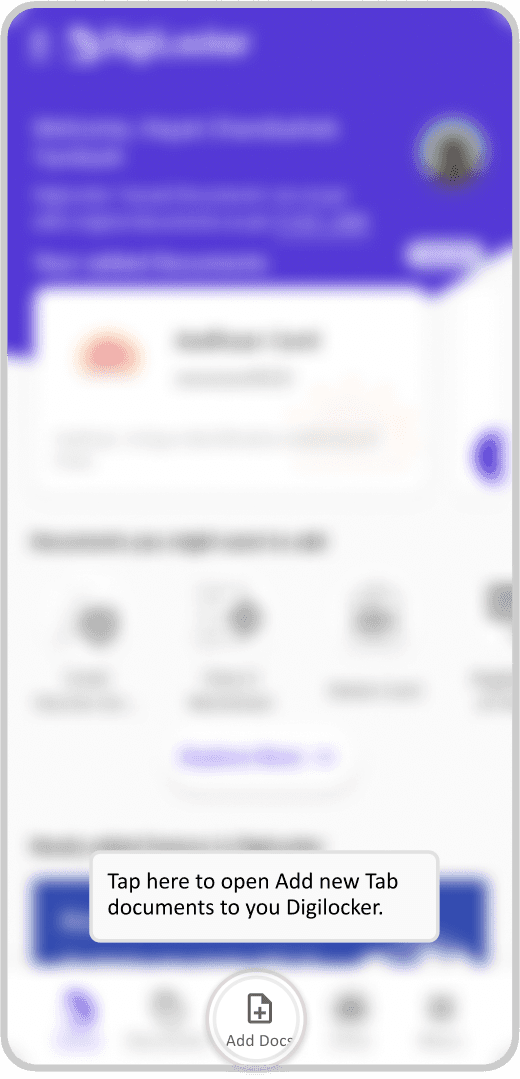
Possible walkthroughs for the application, walking novice user to the functionality of the app.

Your added Documents
Documents you might want to add
Newly added feature in DigiLocker


Home
Documents
Add Docs
Drive
Menu

Aadhar/Username
Mobile NO.
Splash Screen
Sign IN
Sign UP
Sign up Details
PIN/OTP
PIN/OTP
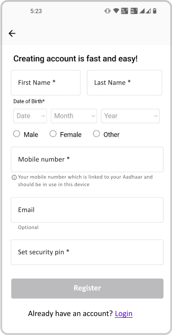
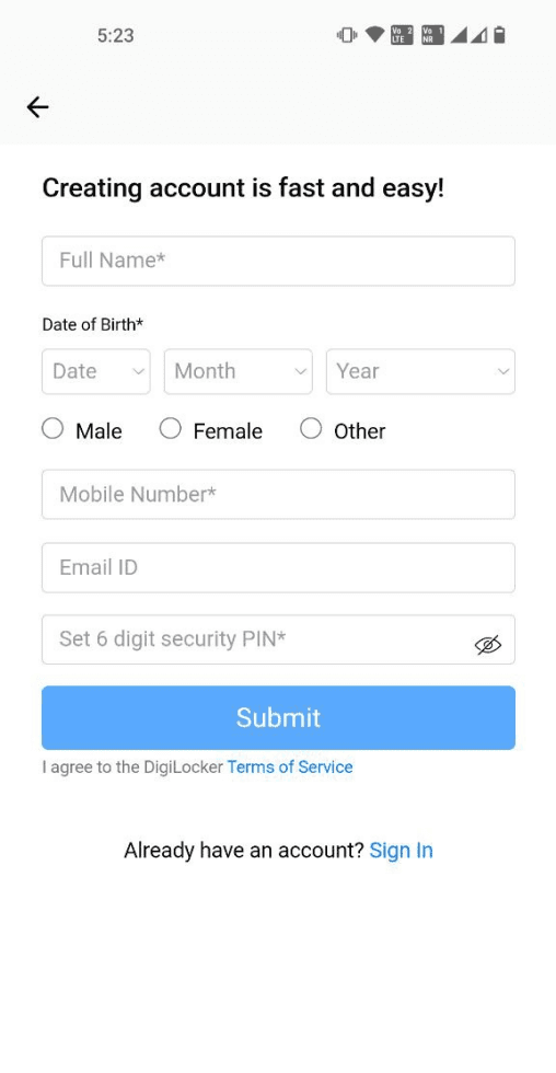
Onboarding Flow
Register page as of now
New screen with recommendations integrated.
Adding link to IT ACT,2000. in case of miscommunication or any dispute.
Fixed headings and colors for icons
More attention to button.
Relevant banners.
PIN/OTP
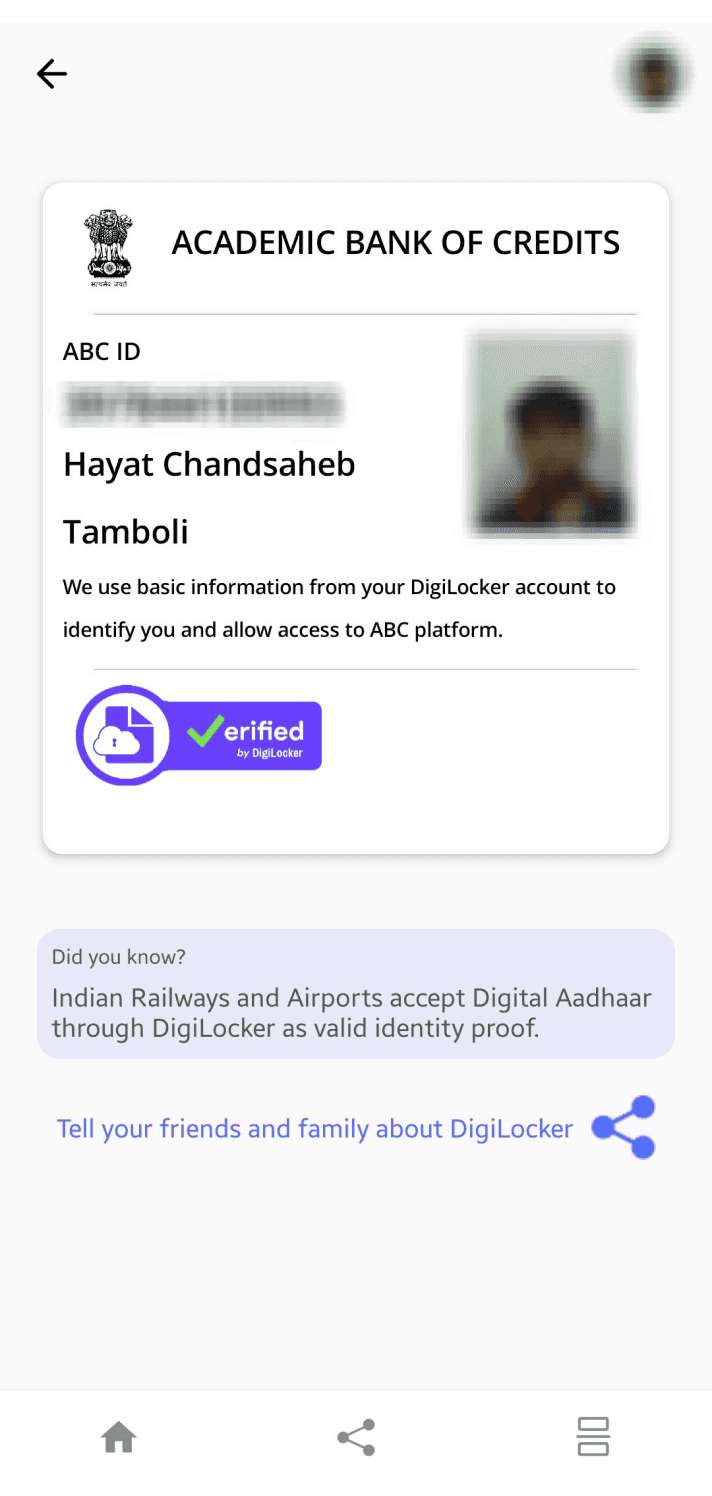
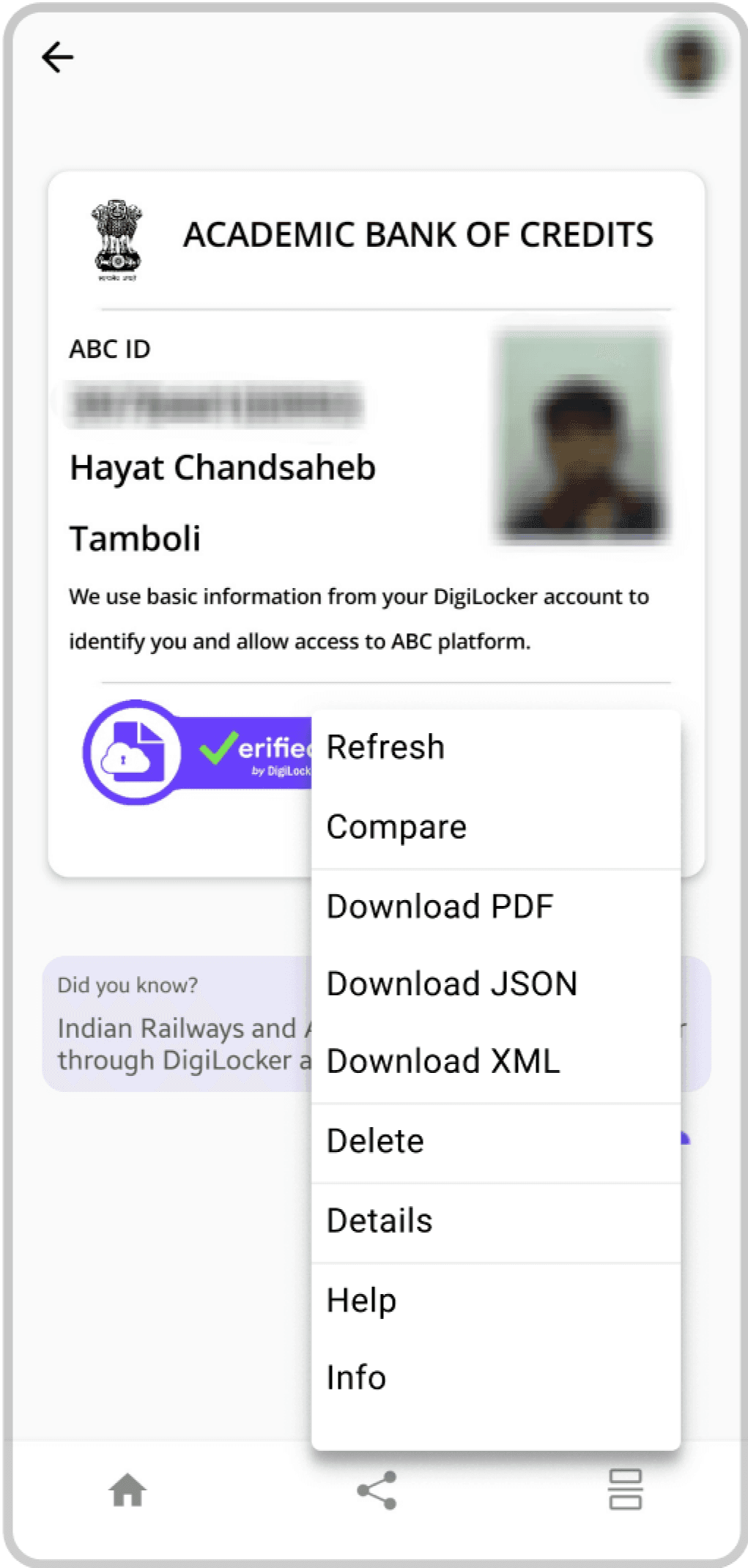
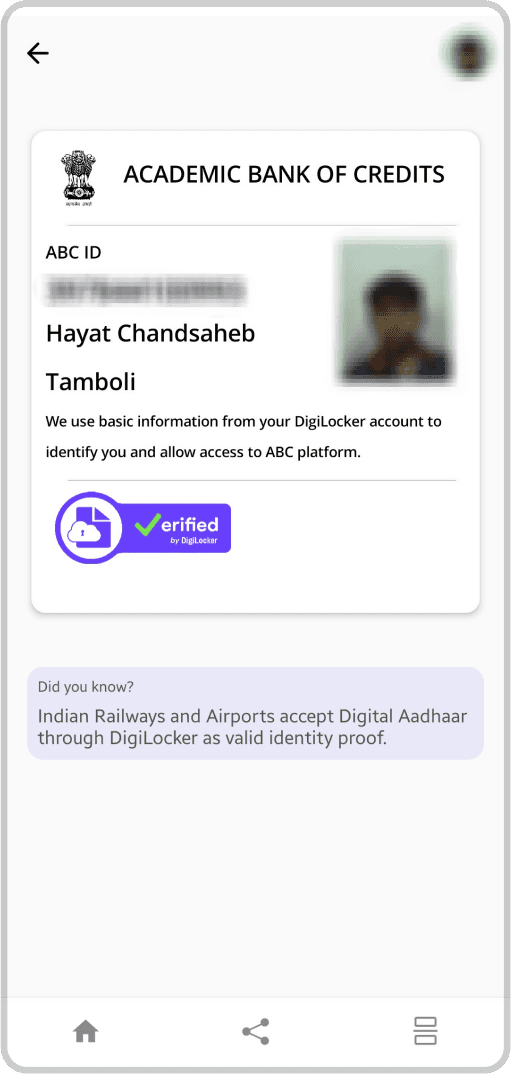
Existing Document view screen
New Document view screen
Kebab Menu Features
Changing Bottom App Bar to accommodate for more features.
Removing extra share button.
Download as PDF, Kebab Menu on Document view page.
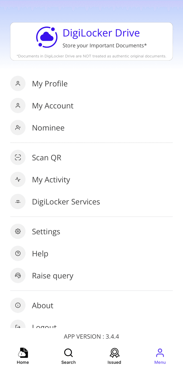
Menu page as of now.
Menu
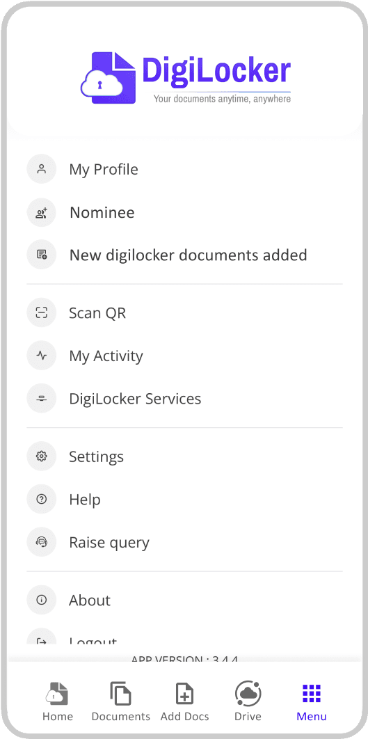
Changed icons to less confusing icons for “Nominee” and “My Profile”
“My Account” section shifted to “My Profile”
“New Digilocker Documents added” section added
Thank you !
yashrawat458@gmail.com

